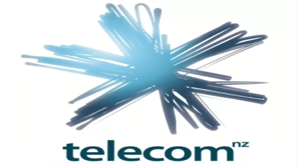
Telecom has a new corporate logo - a chalk-white hand-drawn asterisk, like a star or a spark.
It was unveiled during a laser light show that played on the facade of Auckland's Ferry Building. Telecommunications Review was there, along with a crowd of at least a thousand people. The new logo was displayed on flags positioned beside the Ferry Building and it featured several times during the six and a half minute light show.
Telecom CEO Paul Reynolds describes the new logo as “creative, energetic, full of expression - very fresh and very modern.”
When asked what it means, he replied: “The new Telecom logo means what you want it to mean, it's about you, it's about self expression, it's about customers; what they need and what they want.”
The new logo will be rolled out to all Telecom stores and online sites progressively over the coming weeks and months. Reynolds says the company decided to turn the rebranding of Telecom into a public event - staging the light show this weekend.
"It's a great way of giving back to Auckland," he says.
The light show has been created by Mike Mizrahi from Inside Out Productions, with a team of international digital artists and animators from New Zealand, Australia, UK, USA and Japan. The same company was responsible for the light show on the Auckland Town Hall facade that marked the launch of Telecom's XT Network.
Telecom had been tight-lipped about the reason for the light show, and would neither confirm, nor deny, that the occasion was to launch a new logo, when asked by Telecommunications Review on Thursday (see previous article New Telecom logo - UNCONFIRMED).